
This portfolio is a collection of things that I have designed while studying here at NWTC. I have used illustrator, indesign and photoshop for all of the designs that I have created. I plan to keep adding to this portfolio so that I am able to showcase my best work for my future employers.
Hope that you enjoy!
SMOR
Packaging
Another project from layout and composition 2, the challenge being we had to make a new kind of alcohol for a company that was looking for something new. We got the name of the company which was BeanSpirited, and we also got the description of what the company is about.
The reason I chose to do a s'more flavor with a campfire as the logo because it is a family oriented brand. When you think of sitting by a warm campfire you think of the memories that you are creating with friend and family.
This project was a good experience to work like we are working for a company and making them what they asked for. I also got to print this out and put it on an actual bottle so I could see my work in person.


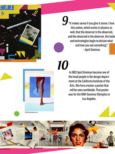
April Greiman Booklet Layout
Logo Recreate - Starbucks


This is one of my most recent projects, done in my Graphic Design Development class. The goal for this project was to take a logo and give it a new look.
As you can see, I chose the Starbucks logo. This logo has been the same for many years and I thought that it would be cool to create something new. One thing I knew going into this project, is that I wanted to showcase the star, it was never a big focal point in the original logo so I knew that it was something I wanted to change.
After many sketches and playing with all the different layouts; I came up with the logo that you see above.
Throughout the design process I knew that I wanted it to have the same colors and also to create it with more of a minimalistic vibe. I think that I was very successful with the design that I came up with. It is exactly what I was picturing in my head.
Above you can see the Brand Manual that I also designed. It has everything from how you can use the logo, to showing you what it will look like on packaging, cups, and signs, as you also see to the right.


Golf Ball Packaging
In my layout and composition 2 class, we had the challenge to create a design as we would when getting information from a client. So we got all the information that they wanted a golf ball box for their swing into summer charity event.
This was a night time event so I chose to create a glow in the dark theme to it to draw the eye in and also make it fun. This assignment was a good test of taking the information from a client and making something that they love out of it.

City Guide - Orlando FL


I created this piece in my Layout and Comp. 1 class. I have always loved Disney World so I decided I would create my trifold about it. It showcases places to stay, fun activities, and yummy places to eat.
When designing this I chose to add fun colors because that is what you think of when you think Disney. I also wanted to incorporate the Mickey Mouse ears so that it kept some tradition and helped you to know what it was going to be about.
I chose to add things such as boxes and lines to outline the words so it gave it a fun but still organized look. I also did not want to overload the brochure with words so I tried to make everything simple and easy to read, because that is what a city guide would normally look like.


This is a design that I created recently in my Digital Print Applications class. The concept was to take the old packaging design from the Austin animal cracker packaging and create something new. So, the design you see on the left is the old design and the design on the right is the design that I created.
When making this design I wanted to make it modern and simple but still something that will draw your eye in and make you want to buy it when you see it in a store. The white sections that you see in both animal prints is the see-through section so that you can see the product through the packaging.

Animal Cracker
Packaging
Recipe Booklet
I created this in my Layout and Comp. 2 class. The project was to create an online recipe book that could be submitted as an online book with buttons that can get you to and from other pages. I gave the mockup to show that this could also be a physical booklet as well.
My idea behind this was that I love making desserts that have pumpkin or cinnamon in it so that's why I chose to base my booklet around fall. I then found some really tasty recipes to add into this booklet that you may want to even try!


